My Market Report
The My Market Report shows the state of your MLS market. To run the report, click My Market under Statistics on the menu.
The following report types are available: Inventory, Sold DOM vs. Units, Sold DOM vs. Sold Price, Volume and Average Price, and Hot Sheet Price Change Trends. Click the drop-down list next to the My Market Report title to choose a report.
Note
These reports do not display up-to-the-minute statistics. Instead, cached data is used to generate the reports more quickly. As a result, recent updates may not be reflected.
You can generate a report from any search criteria, which allows nearly unlimited customization of the data. Click Customize and select either Quick Search or Saved Search to define search criteria.
Click Email to send a link to the report or click Print to print a copy of the report. Click Advanced to detach the report into a new window, or to choose an export option. Click Export data displayed on page to export only the data that appears in the current report. Click Export all downloaded data to export all data for the current report and all other reports on the My Market page for the current search criteria.
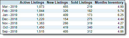
Immediately below each My Market chart, the statistics are presented in a table where you can easily compare numbers by calendar month.
The Inventory chart displays a graphical representation of the state of your MLS market over the past two years. Using the bars and the red, gold, and black lines, you can track the inventory at rate of sales, and the number of active, new, and sold listings.
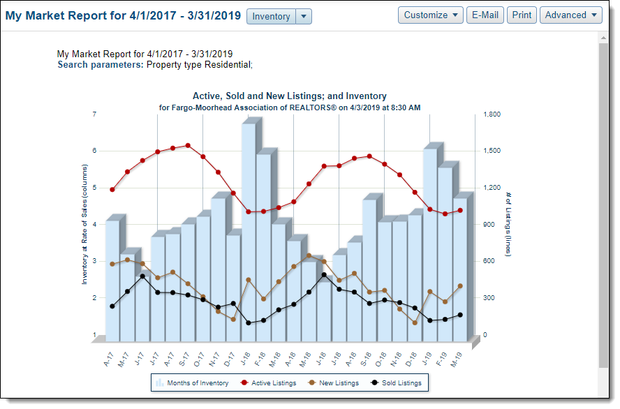
The bars represent the months of inventory at the current rate of sales. The vertical legend at the left side of the graph shows the units of measurement, or you can hover over any bar to see the exact measurement for that month. The red, gold, and black lines correspond to the vertical legend at the right side of the graph. The red line tracks by month the number of active listings, black the number of sold listings, and gold the number of new listings. Hover the cursor over a line in any month to see exact values for that month.
Below the graph, you can view a numeric representation of the data. In table format, you can easily compare listings and inventory month-by-month over the selected time period.
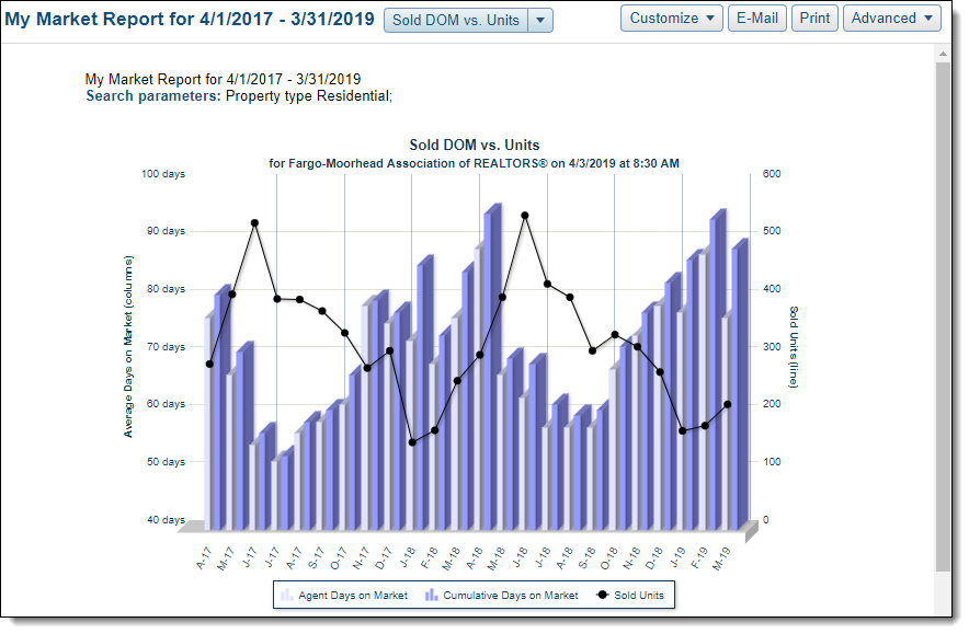
The Sold DOM vs. Units graph shows Average Days on Market (calculated according to the preference of your MLS) and Sold Units. The columns represent the DOM, and the black line represents the number of sold units. Below the graph, you can view a numeric representation of the data.
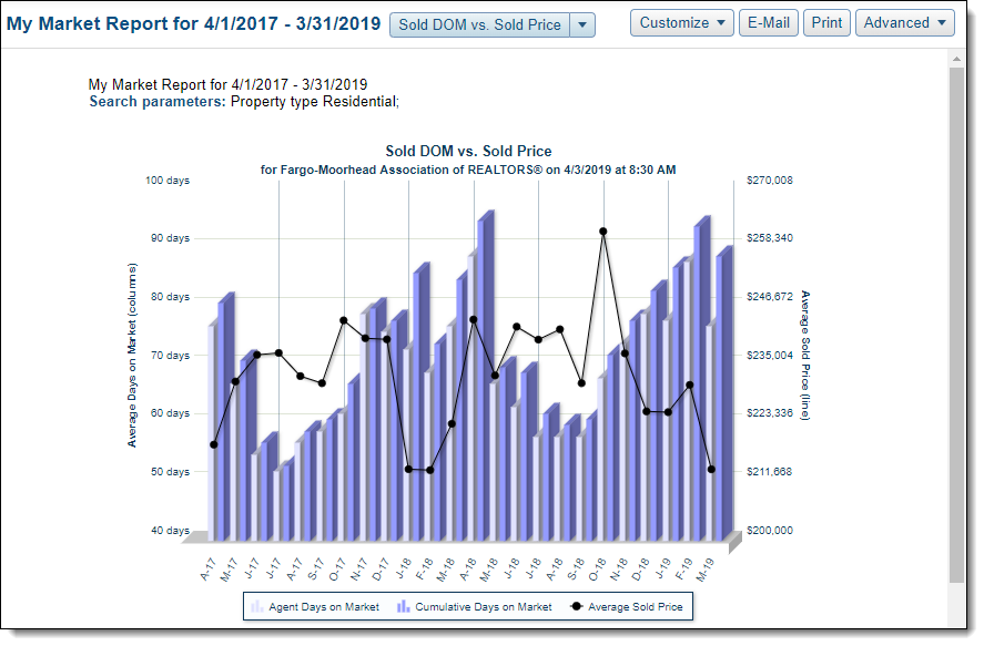
The Sold DOM vs. Sold Price graph shows a comparison between the Average Days on Market (calculated according to the preference of your MLS) for sold listings and average sold price. The Average Days on Market is displayed in columns and the average sold price is represented by a black line. Data is presented for the past two years. Below the graph, you can view a numeric representation of the data.
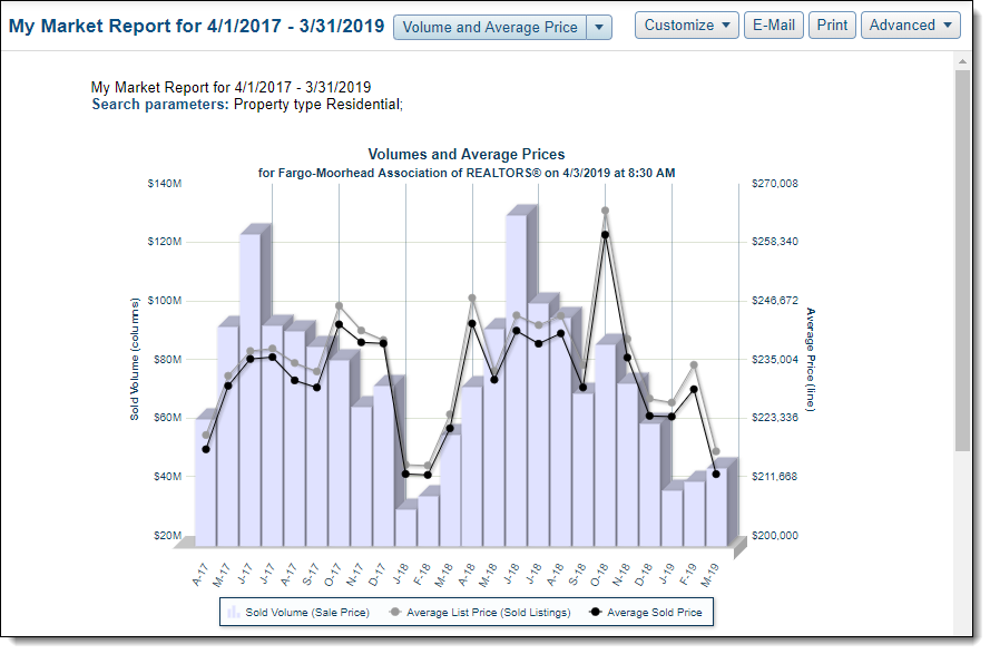
The Volumes and Average Prices graph compares the sold volume (bars) to the average list price of the sold listings (grey line), and the average sold price (black line) over the last selected time period. Below the graph, you can view a numeric representation of the data.
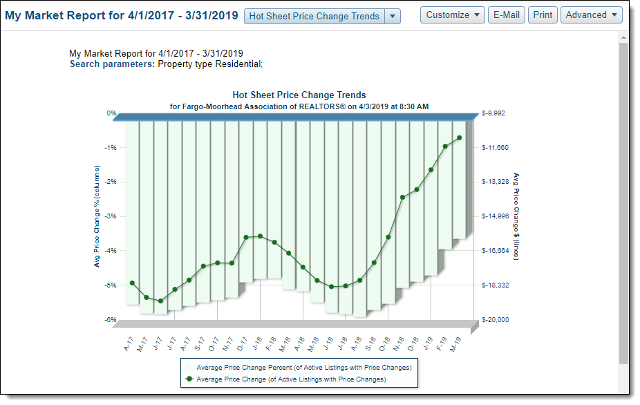
The Hot Sheet Price Change Trends chart shows the average price change percentage in comparison to the average price change in dollars. This graph is based only on listings where the list price was changed. Below the graph, you can view a numeric representation of the data.
Note
This report may not be available, depending on your MLS.